
Best budget monitors for eyesight are usually the ones that reduce flicker, tame glare, and match your workspace, not the ones with the flashiest specs on the box.
If you work long hours, you already know the feeling, dry eyes, headaches, or that “sandpaper” fatigue after a few Zoom calls and spreadsheets. A monitor won’t solve every comfort issue, but it can remove a lot of unnecessary strain when you pick the right panel, coating, brightness range, and ergonomics.
This guide focuses on what actually matters for eye comfort on a budget, how to sanity-check marketing claims, and how to set up your screen so you feel the difference in a few days, not months.
What “eye comfort” really means for a monitor
Eye comfort is mostly about avoiding constant micro-stress: your eyes fighting flicker, squinting at low contrast, or re-focusing because text looks slightly fuzzy. Some people also feel worse under harsh overhead lighting or when glare bounces off the screen.
According to the American Optometric Association, digital eye strain can show up as dry eyes, headaches, blurred vision, and neck or shoulder discomfort, so comfort is not only a screen issue, it’s also posture and viewing habits.
- Flicker control: many modern displays reduce PWM dimming, which can bother sensitive users.
- Glare management: matte coatings and good positioning often beat “anti-glare” buzzwords.
- Readable text: resolution, scaling, and panel quality drive how crisp fonts look.
- Ergonomics: height and tilt matter because discomfort often starts in the neck.
Key features to prioritize (and what you can ignore)
On a tight budget, you want a short list of “must-haves” and a longer list of “nice-to-haves,” because chasing everything usually pushes you into midrange pricing.
Prioritize these for eye comfort
- IPS or IPS-like panels: typically more stable viewing angles and consistent text contrast than many low-end TN panels.
- Matte finish: reduces mirror reflections in most rooms, especially with windows nearby.
- Brightness range: you want a display that can get dim enough for evening use without needing to crush contrast.
- Flicker-free / low flicker mode: helpful for people who feel eye fatigue fast, though labeling varies by brand.
- Simple ergonomics: at minimum, tilt; height adjust is a real quality-of-life jump if you can find it.
Usually not worth paying extra for (for comfort alone)
- Very high refresh rate if you mainly read and write; it can feel smoother, but comfort gains vary by person.
- HDR badges on budget models; these often add little for text-heavy work.
- “Eye-care” branding without specifics like flicker control, coating type, and usable brightness steps.
Quick self-check: which monitor issues are likely causing your strain?
Before buying anything, pin down what’s bothering you. Different problems point to different specs, and this is where many “best budget monitors for eyesight” searches go sideways.
- You squint or lean in → you may need a larger screen, higher resolution, or better scaling, not more brightness.
- Your eyes feel tired at night → check brightness minimum, warm color presets, and room lighting balance.
- Headaches after short sessions → flicker sensitivity is possible, also check contrast, glare, and posture.
- Dry, gritty feeling → often a blink-rate and HVAC issue, but reducing glare and lowering brightness can help.
- Text looks “shimmery” → look at sharpness settings, ClearType (Windows), or try a different panel type.
If symptoms are intense, persistent, or sudden, it’s smart to consult an eye care professional because screen tweaks can’t rule out vision changes or medical causes.
Budget monitor sweet spots: size, resolution, and scaling
The most comfortable budget setup is often boring in the best way: a size and resolution that lets you read without zooming in and out all day.
- 24-inch 1080p: usually the best value; comfortable if you sit at a typical desk distance and use 100% scaling.
- 27-inch 1440p: a strong comfort upgrade for text clarity and workspace, but it costs more.
- 27-inch 1080p: can be fine for some, but text may look softer; try in person if you’re sensitive.
On macOS and Windows, scaling choices matter as much as raw resolution. If you buy a sharper panel but set odd scaling, you can still end up with fuzzy type and more fatigue.
Shortlist: best budget monitor types for eyesight (by use case)
Instead of pretending there’s one winner, here are the budget categories that usually work well, with the tradeoffs stated plainly.
| Use case | What to look for | Common budget compromise |
|---|---|---|
| Office work, browsing, school | 24" IPS, matte, low-flicker, easy OSD, tilt | Stand height not adjustable |
| Long documents, coding | 27" 1440p IPS, good text clarity, comfortable minimum brightness | Higher price, fewer ports |
| Bright rooms, near windows | Matte coating, higher usable brightness, strong anti-glare positioning | Blacks look a bit gray in IPS |
| Mixed work + casual gaming | IPS, 75–144Hz if affordable, low-flicker, decent overdrive controls | HDR marketing with limited impact |
If you want a practical shopping filter, start with: IPS + matte + low flicker + a stand you can live with. That combo covers most “I just want my eyes to stop hating this” scenarios.
Setup matters as much as the monitor (do this before you return it)
This is the part many people skip, then blame the display. A decent budget screen can feel dramatically better with a few settings and placement tweaks.
Dial in the basics in 10 minutes
- Lower brightness until white pages stop looking like a light panel; match the room, not your ego.
- Set color temperature warmer at night; during the day, neutral often feels cleaner for text.
- Turn down “sharpness” if it adds halos around letters.
- Position to avoid reflections: angle the screen, move a lamp, or shift the monitor a few inches.
Ergonomics that reduce strain fast
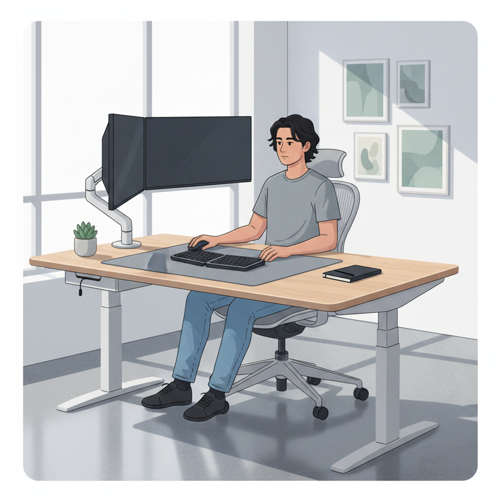
- Top of screen near eye level, so you’re not craning your neck up or down.
- Arm’s-length distance as a starting point; adjust based on font size and comfort.
- Use a monitor arm or riser if the included stand is too low, this is often cheaper than upgrading the monitor.
Common mistakes when buying budget monitors for eye comfort
A few patterns show up again and again, especially when people shop fast and rely on star ratings only.
- Buying too big at too low resolution, then fighting fuzzy text all day.
- Cranking brightness to 100% because it “looks better” in the first five minutes.
- Assuming blue light is the whole story; glare, flicker, and poor posture often matter more.
- Ignoring the stand; if the monitor can’t reach eye level, discomfort sneaks in.
- Using the wrong cable or mode; sometimes HDMI vs DisplayPort changes available refresh rates or color settings.
According to the National Eye Institute, taking regular breaks and managing screen habits can help with digital eye strain, so even the best budget monitors for eyesight work better when paired with smarter routines.
When to get extra help (or consider an upgrade)
If you still feel strain after a week of sensible settings and posture fixes, the limiting factor might not be the panel. It might be your prescription, dry eye, migraines, or an unusually glare-heavy workspace.
- Talk to an optometrist if you notice new blur, frequent headaches, or symptoms that persist off-screen.
- Consider a bigger jump if you read text all day and can stretch: 27" 1440p with good ergonomics is a common “finally comfortable” point.
- Consider a second cheap light if your room has harsh contrast; balanced lighting can be more effective than another monitor swap.
Conclusion: how to pick a budget monitor your eyes can live with
Comfort comes from a few boring choices done well: a crisp-enough resolution for your screen size, low-flicker behavior, a matte surface in a glare-prone room, and a setup that keeps your head and eyes relaxed.
Key takeaways: prioritize IPS and matte, don’t overbuy size at 1080p, and spend a little effort on brightness and placement before deciding you chose wrong.
If you want one simple next step, shortlist two or three models that match your size and resolution target, then use the self-check list above to pick the one that best fits your actual strain pattern.
FAQ
- Are “eye care” monitors actually better for eyesight?
They can be, but only when the features are concrete, like low-flicker dimming and a usable low-brightness range. Branding alone does not guarantee comfort. - Is a 24-inch 1080p monitor good for eye comfort?
For many people, yes, especially at typical desk distance. If you’re sensitive to text sharpness or sit close, 27-inch 1440p often feels easier. - Does blue light filtering reduce eye strain?
It may help some people feel more comfortable at night, but a lot of strain comes from glare, high brightness, and not taking breaks. If sleep is affected, warmer settings can be worth using. - What brightness should I use to reduce fatigue?
There isn’t one number that fits everyone. A good rule is: make white backgrounds match the brightness of the paper in your room, then adjust slightly for comfort. - Is matte always better than glossy for eye strain?
In many home and office setups, matte reduces reflections and feels easier. In controlled lighting, glossy can look sharper, but glare can become a daily annoyance. - Do higher refresh rates help with eye comfort?
Sometimes. For scrolling and motion, smoother refresh can feel better, but it won’t fix glare, poor ergonomics, or blurry text, which are more common culprits. - What’s the easiest way to improve comfort without buying a new monitor?
Lower brightness, reduce reflections, set the screen to eye level, and use OS text tuning (like Windows ClearType). These changes often deliver quick wins.
If you’re comparing a few listings and want a more straightforward path, pick a screen size and resolution first, then filter for IPS, matte, and low-flicker claims, and use your return window to test comfort with real work, not just a demo wallpaper.